Nike India
Nike India
Nike India
Nike India
Motion Design for Nike India
Motion Design for Nike India
Motion Design for Nike India
Motion Design for Nike India
0.1
0.1
0.1
Nike India
Nike India
Nike India
IMAGE
IMAGE
IMAGE
My Role
My Role
My Role
My Role
Motion Designer - Motion Design, Brand Design
Motion Designer - Motion Design, Brand Design
Motion Designer - Motion Design, Brand Design
Overview
Overview
Overview
Overview
This project is a curated collection of motion design work created for Nike India.
The work includes promotional animations for social media, new store launches, cultural moments, and exclusive events.
Each piece was designed to align with Nike’s bold, energetic brand language while adapting motion styles for different campaigns, formats, and timelines.
My role focused on translating campaign intent into dynamic motion, creating short, impactful animations optimised for digital platforms and real-world brand moments.
This project is a curated collection of motion design work created for Nike India.
The work includes promotional animations for social media, new store launches, cultural moments, and exclusive events.
Each piece was designed to align with Nike’s bold, energetic brand language while adapting motion styles for different campaigns, formats, and timelines.
My role focused on translating campaign intent into dynamic motion, creating short, impactful animations optimised for digital platforms and real-world brand moments.
This project is a curated collection of motion design work created for Nike India.
The work includes promotional animations for social media, new store launches, cultural moments, and exclusive events.
Each piece was designed to align with Nike’s bold, energetic brand language while adapting motion styles for different campaigns, formats, and timelines.
My role focused on translating campaign intent into dynamic motion, creating short, impactful animations optimised for digital platforms and real-world brand moments.
This project is a curated collection of motion design work created for Nike India.
The work includes promotional animations for social media, new store launches, cultural moments, and exclusive events.
Each piece was designed to align with Nike’s bold, energetic brand language while adapting motion styles for different campaigns, formats, and timelines.
My role focused on translating campaign intent into dynamic motion, creating short, impactful animations optimised for digital platforms and real-world brand moments.
1.0
Nike India : Happy 2024
VIDEO
Nike India : Happy 2024
Nike India : Happy 2024
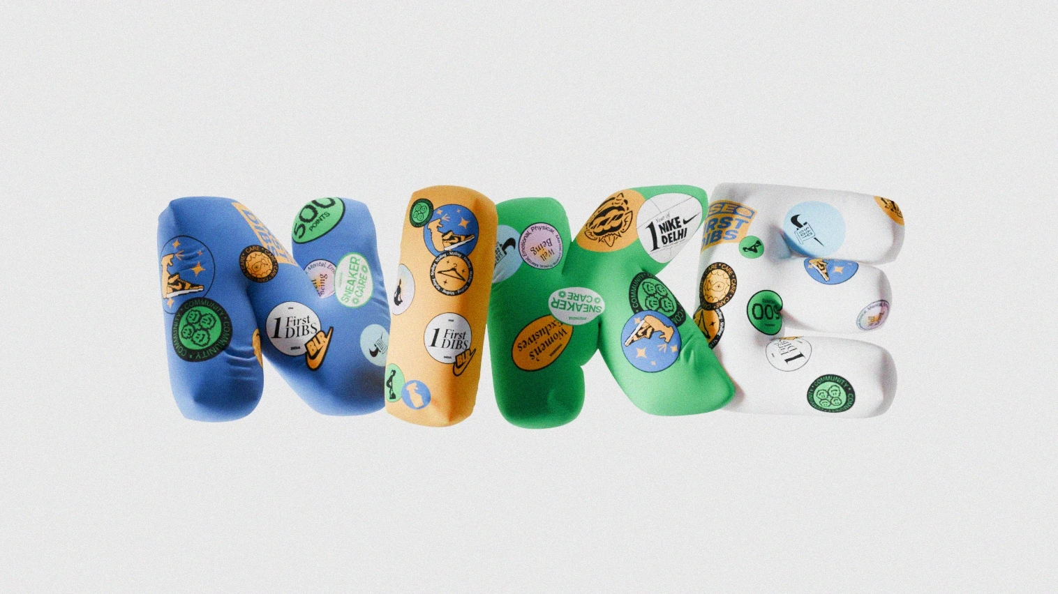
For New Year 2024, I created a celebratory social animation built around the metaphor of balloons.
The year “2023” appears as floating balloons, symbolizing the year drifting away. The final “3” transforms into a “4,” marking the transition into 2024 before rising and flying off-screen.
The animation concludes with a burst of falling confetti to emphasize celebration and momentum.
To reinforce Nike India's brand presence, signature sticker-style graphic elements from their visual language were integrated directly onto the balloons.
For New Year 2024, I created a celebratory social animation built around the metaphor of balloons.
The year “2023” appears as floating balloons, symbolizing the year drifting away. The final “3” transforms into a “4,” marking the transition into 2024 before rising and flying off-screen.
The animation concludes with a burst of falling confetti to emphasize celebration and momentum.
To reinforce Nike India's brand presence, signature sticker-style graphic elements from their visual language were integrated directly onto the balloons.
2.0
Nike India : Happy 2025
VIDEO
Nike India : Happy 2025
Nike India : Happy 2025
For the 2025 New Year animation, we moved away from celebratory symbols and leaned directly into Nike’s product language.
The concept centered around shoelaces an everyday but iconic detail of performance footwear.
In the final animation, dynamic shoelaces weave and curve to form the words “Happy 2025”, combining fluid motion with controlled tension to mirror the precision of sport.
Nike branding elements were integrated onto the laces, turning them into both a typographic and brand-driven visual device.
For the 2025 New Year animation, we moved away from celebratory symbols and leaned directly into Nike’s product language.
The concept centered around shoelaces an everyday but iconic detail of performance footwear.
In the final animation, dynamic shoelaces weave and curve to form the words “Happy 2025”, combining fluid motion with controlled tension to mirror the precision of sport.
Nike branding elements were integrated onto the laces, turning them into both a typographic and brand-driven visual device.
3.0
Nike India : Happy 2026
VIDEO
Nike India : Happy 2026
Nike India : Happy 2026
For the 2026 New Year animation, the concept began with a familiar and iconic object the Nike shoe box.
The box rolls into frame, builds anticipation, and opens to reveal balloons forming “Happy 2026.” Inside, the box is packed with Nike India sticker-shaped balloons, blending celebration with unmistakable brand cues.
As the numbers rise and fill the frame, the animation concludes with a burst of confetti, amplifying the sense of momentum and festivity.
The piece combines product familiarity with playful motion, creating a celebratory moment rooted in Nike’s retail and visual identity.
For the 2026 New Year animation, the concept began with a familiar and iconic object the Nike shoe box.
The box rolls into frame, builds anticipation, and opens to reveal balloons forming “Happy 2026.” Inside, the box is packed with Nike India sticker-shaped balloons, blending celebration with unmistakable brand cues.
As the numbers rise and fill the frame, the animation concludes with a burst of confetti, amplifying the sense of momentum and festivity.
The piece combines product familiarity with playful motion, creating a celebratory moment rooted in Nike’s retail and visual identity.
4.0
Nike India : Orion
VIDEO
Nike India : 1 Year Anniversary, Orion Mall Bengaluru
Nike India : 1 Year Anniversary, Orion Mall Bengaluru
Created to celebrate the one-year anniversary of the Nike store at Orion Mall, Bengaluru, this animation centers around branded balloons rising and colliding in motion.
As they float upward, Nike India sticker elements reinforce the brand identity while the movement gradually reveals the message “1 Year Anniversary.”
To elevate the celebration, select transparent glass balloons contain exclusive sneakers available for the anniversary sale blending festivity with product storytelling.
The piece concludes with a burst of confetti, amplifying the sense of momentum and milestone achievement.
Created to celebrate the one-year anniversary of the Nike store at Orion Mall, Bengaluru, this animation centers around branded balloons rising and colliding in motion.
As they float upward, Nike India sticker elements reinforce the brand identity while the movement gradually reveals the message “1 Year Anniversary.”
To elevate the celebration, select transparent glass balloons contain exclusive sneakers available for the anniversary sale blending festivity with product storytelling.
The piece concludes with a burst of confetti, amplifying the sense of momentum and milestone achievement.
5.0
Nike India : Indiranagar
VIDEO
Nike India : Store Launch, Nike Indiranagar, Bengaluru
Nike India : Store Launch, Nike Indiranagar, Bengaluru
Created for the launch of the Nike store in Indiranagar, Bengaluru, this piece blends real-world footage with 3D CGI animation.
The storefront entrance was filmed on location, then enhanced through composited motion graphics to build anticipation.
A digital curtain drop reveals the store doors opening, followed by a burst of Nike India–branded balloons flowing outward into the scene.
The combination of live-action realism and celebratory CGI transforms a physical retail moment into a dynamic launch announcement for social media.
Created for the launch of the Nike store in Indiranagar, Bengaluru, this piece blends real-world footage with 3D CGI animation.
The storefront entrance was filmed on location, then enhanced through composited motion graphics to build anticipation.
A digital curtain drop reveals the store doors opening, followed by a burst of Nike India–branded balloons flowing outward into the scene.
The combination of live-action realism and celebratory CGI transforms a physical retail moment into a dynamic launch announcement for social media.
6.0
Nike India : Jayanagar
VIDEO
Nike India : Store Launch, Nike Jayanagar, Bengaluru
Nike India : Store Launch, Nike Jayanagar, Bengaluru
For the launch of the Nike store in Jayanagar, Bengaluru, we expanded the concept by blending drone-shot city landmarks with CGI-enhanced storefront visuals.
The film opens with aerial footage of Jayanagar, grounding the launch within its local context before transitioning to the store entrance.
A digital curtain drop reveals the storefront, followed by Nike India sticker-shaped balloons flowing outward into the scene.
By combining real-world footage with composited 3D elements, the piece elevates a retail opening into a dynamic, city-scale announcement.
For the launch of the Nike store in Jayanagar, Bengaluru, we expanded the concept by blending drone-shot city landmarks with CGI-enhanced storefront visuals.
The film opens with aerial footage of Jayanagar, grounding the launch within its local context before transitioning to the store entrance.
A digital curtain drop reveals the storefront, followed by Nike India sticker-shaped balloons flowing outward into the scene.
By combining real-world footage with composited 3D elements, the piece elevates a retail opening into a dynamic, city-scale announcement.
Next Project
Next Project
Next Project
Avni OS
Avni OS
Avni OS
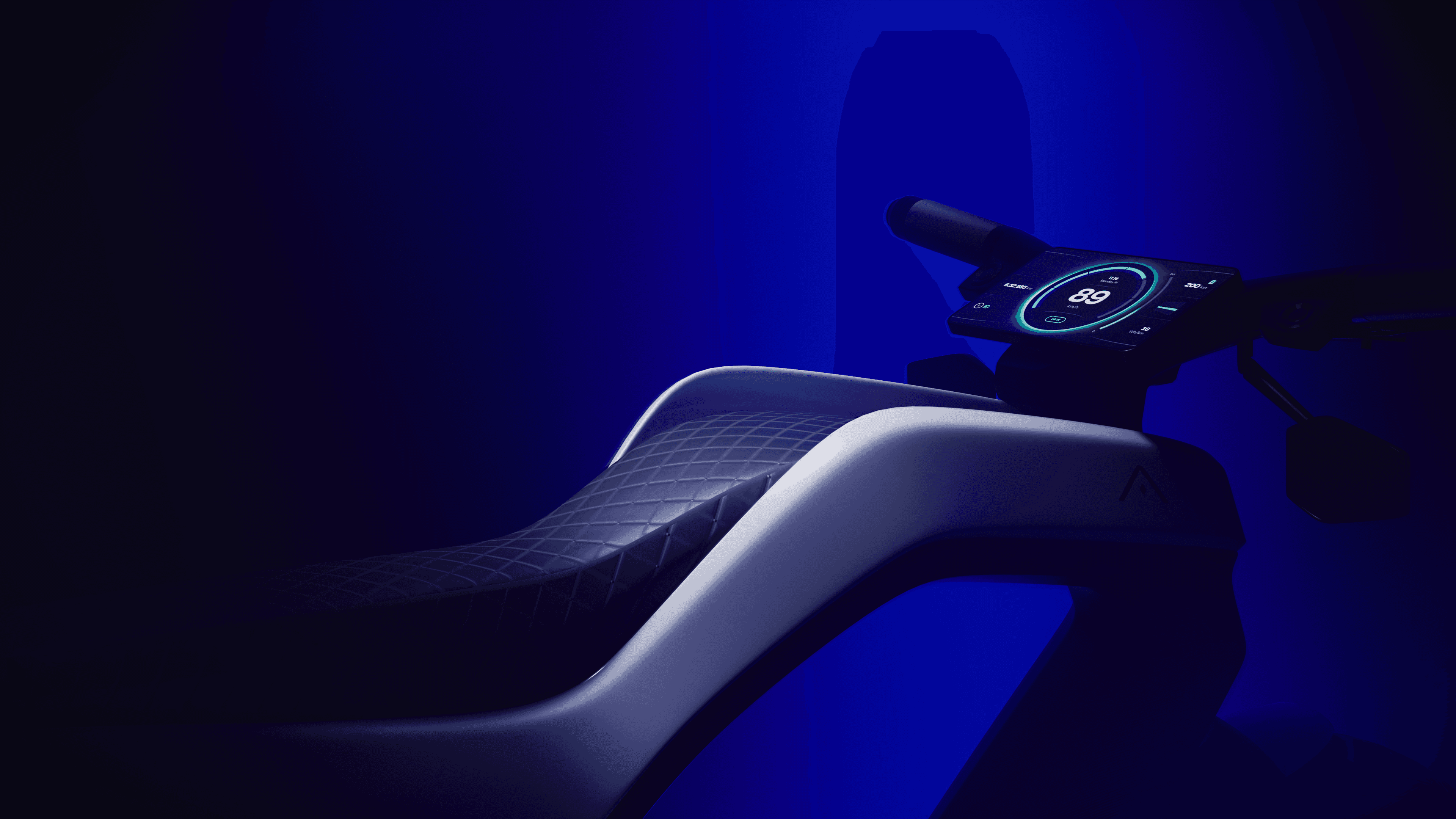
A modular, highly customizable vehicle operating system
A modular, highly customizable vehicle operating system
A modular, highly customizable vehicle operating system
50 Days of Motion
50 Days of Motion
50 Days of Motion
Crafting 50 animations in 50 days
Crafting 50 animations in 50 days
Crafting 50 animations in 50 days